Have you ever heard of the joke about centering a div? The answer is always well...drum roll...margin auto. well the twitter guys are always like...
That Joke is dead since flex box and grids.
Well it is true but these are not used for only centering things. I mean that is not their only purpose. Understanding grids will have you creating complex layouts. Flex box on the other works very well on small layouts like phones. Yes it can also be used for bigger screen.
I want you to understand both. They really work well together and you don't have to do positions and stuff. Just Grids.
Grids
In design, having a grid to watch your back is quite good. When placing content around while maintaining the rules of the third or golden rule, grids are the gods. Everything sticks to a grid and so if you have grids, you are able to copy the designs quite well if you are a frontend developer.
display:grid;
When you think of grids, think of that maths exercise books. I am not trying to trigger your PTSD but I guess I will do it.
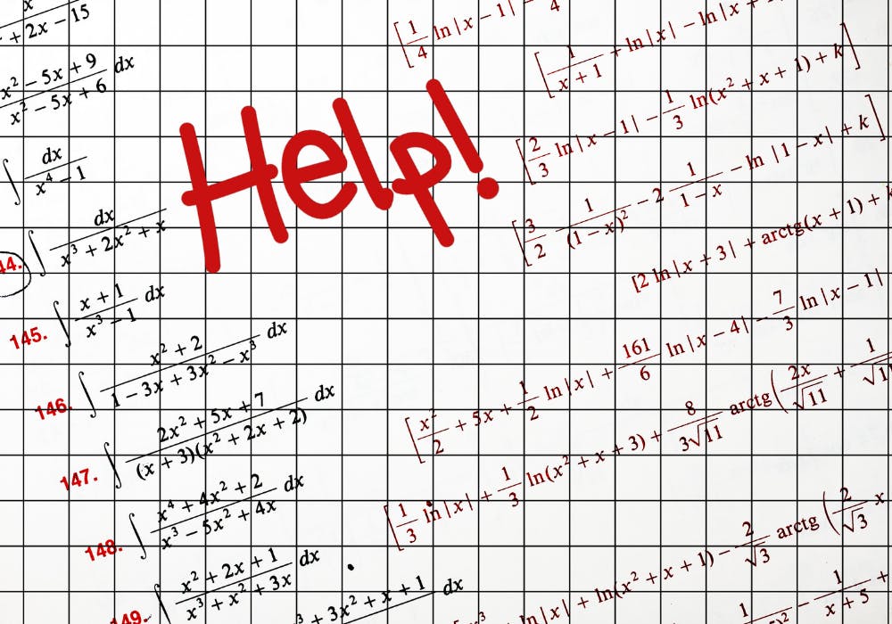
The whole paper represents the border-box/container. This is where the grid layout will lie. Border box is the standard but some use content-box. I literally don't know who? Comment if you do.
The boxes represents the rows and columns that intersect to form grids.
Okay, I'll slow down.
Row is to HoRzontal as Column is to vertiCal 1, 2 sing...
Well you can't have grids and columns without defining them. Yeah you first ask for what you want. And how do you do that?
Grid template columns and grid template rows.
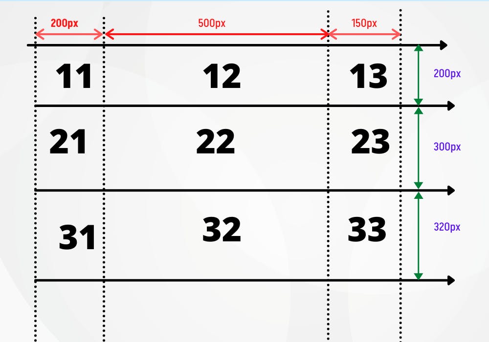 Hm, 3 by 3 matrices? Oh my nightmares! Nope just some numbers to represent the boxes.
11, 12 and 13 represent one row. Yes. But 11, 12 and 13 have different widths. Columns come into play here. A column divides a row into whatever width you define. Hm, confusing. Being a Quantity Surveyor we learn a lot of columns in the university. Columns are vertical. They are used to transfer the weight of the building to the foundation. They are distributed such that they share the weight of the building. Same way to columns in grids they share the width of the row.
well 12 took 500px. Maybe the guy wanted an Image there so he set the width of 12 at 500px. How did he do it? First define the row. The first row is 200px in height. check the green arrows.
display: grid:
grid-template-rows:200px;
grid-template-columns:200px 500px 200px;
We defined one row i.e 200px and three columns 200px 500px 200px
What if we defined all three rows directly?How? well:
grid-template-rows:200px 300px 320px;
That is it, just like that we formed the complex pattern above. That pattern is our grid-layout
Why are grids powerful?
Well, drumroll... coordinates! He brought up math again. No. Remember(x,y)? You have used the positon absolute (top-o right-0)right?
Well here you can define what you want.
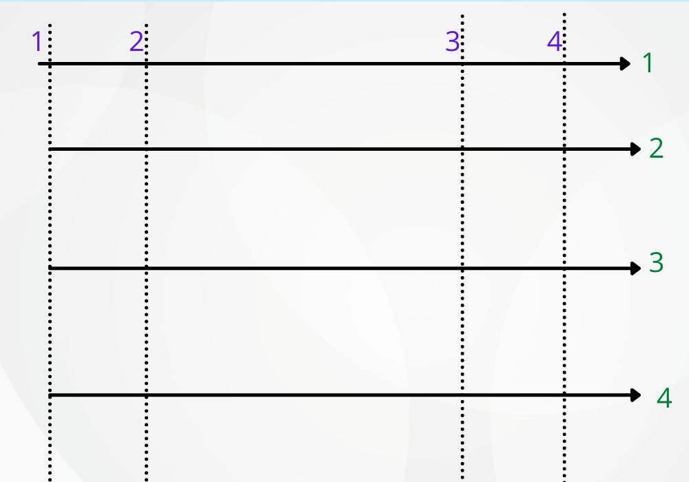
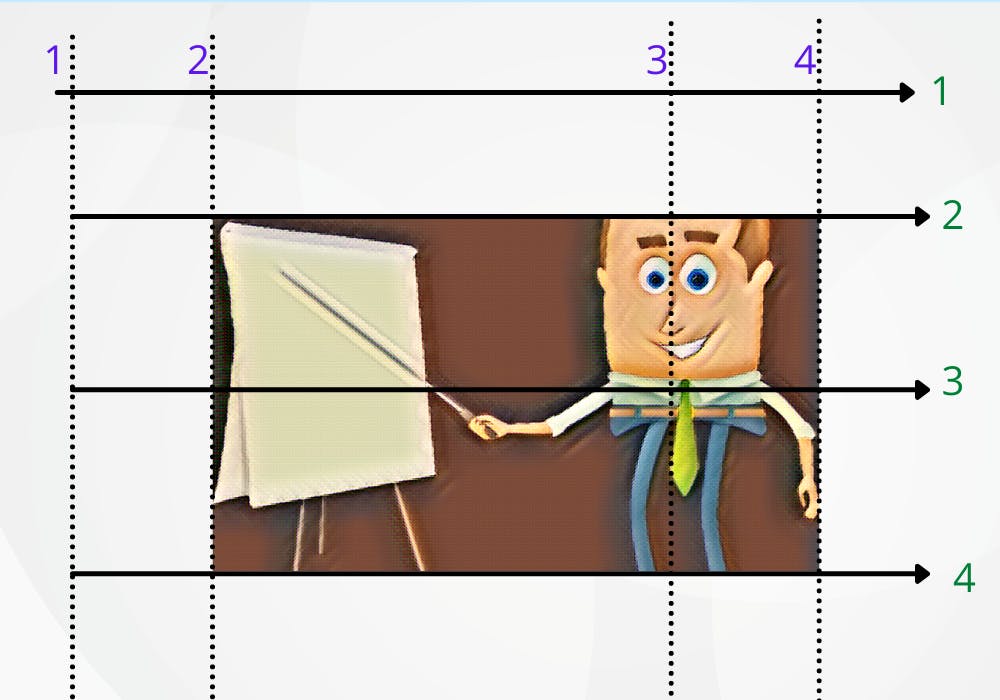
I wanted an image of me in the grids. How do I place it on my grid layout without positions and defining widths and lengths. Well:
grid-column- start & end , grid-row start & end.
I named the lines 1,2,3,4. Why? because those are used to define the start and ends of rows and columns
In the image...the column starts from 2 and ends at 4 The row also starts at 2 and ends at 4 I didn't intend it but you get the idea. You have a grid layout and you can define where you want an element to start and end.
Why don't we start from zero? I knew CSS was not a programming language. time to go and cause violence on twitter. Well, the count starts from the 1 not zero. Haven't checked the reason myself.
img{
  grid-column-start: 2;
  grid-column-end: 4;
  grid-row-start:2;
  grid-row-end: 4;
}
We are getting there. We can define more with grids. This is just the basic to focus on what confuses people. There is more.
Well in the layout you can:
- justify-items: start | end | center | stretch;
- align-items: start | end | center | stretch;
- define row and column gaps
- define the auto-flow of the grids.
More information about grids check MDN Docs and my all time reference point CSS tricks
